Customize Folder Options
This is the largest section of this guide. The changes in Windows Explorer are significant and you should know your options. In addition I wanted to show as many of the options I could to the folks who’ve been scared to try Windows 8 because of all the FUD written about it all over the internet. IMHO this new interface makes the options most folks use far more apparent than in previous Windows versions, and thus more user friendly. (Still, it wouldn’t have killed them to make the old menu style available.) Long ago I adopted my “when in doubt, right-click” strategy and I right-click everything. All the right-click options you are used to are still there.
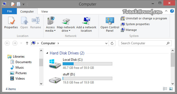
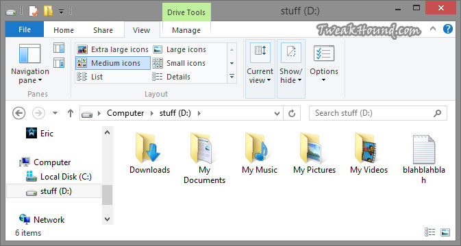
This is the initial view from my computer.
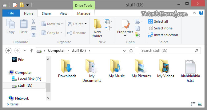
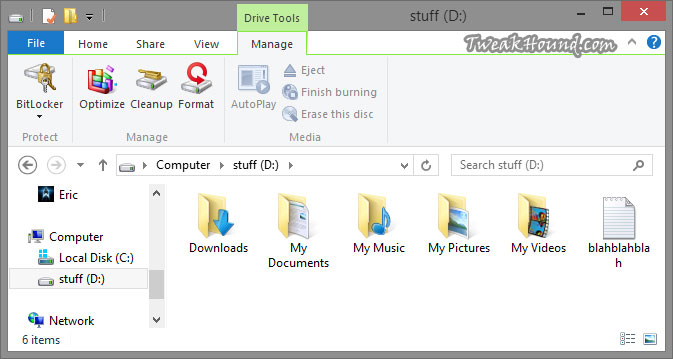
Opening the drive brings more options. This is the Home tab.
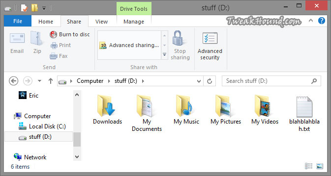
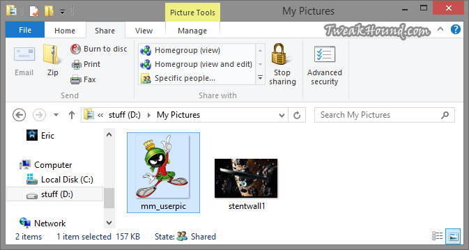
The Share tab. I like how Advanced Security Settings are one click away.
The View tab. Options are pretty much unchanged from Windows 7 but now you don’t have to navigate with a menu. It’s all where you can see it. Rolling over an option will immediately show you a preview of what that option looks like. See the next section entitled Folder View Options for more on this.
The Manage tab. I would like to see an Error Checking option here like in Properties > Tools.
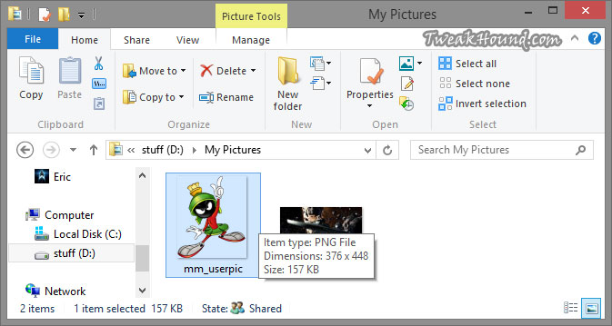
Opening the folder brings more options in the menus.
Folder View Options
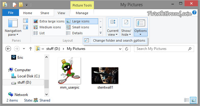
While most users won’t need to go further than the options in the View tab The Folder Options window has more settings. Get there by clicking the Options icon > Change folder and search options.
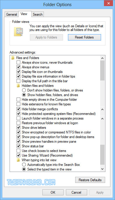
Here are all your Folder view options. My preferences are as you see below.
It should be noted that if you uncheck the Hide protected operating system files box you’ll have to look at those desktop.ini and thumbs.db files everywhere including the desktop.
Oh, and for the love of all that is Geeky. Checking the Launch folder windows in separate process box is not a performance tweak. It is a legacy stability setting that actually uses more of your memory. Please see by Bad Tweaks page.
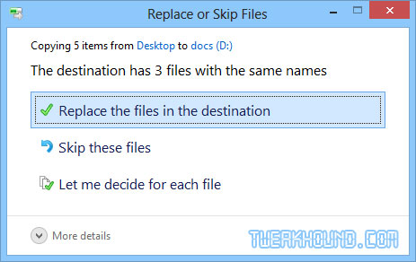
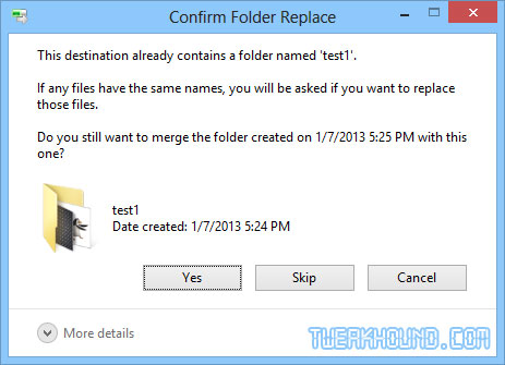
About the above setting Hide folder merge conflicts. This is a good a time as any to discuss it. Virtually every bit of advice at every site I’ve seen gets this wrong. The only thing this setting changes is that unchecking it adds a completely pointless Window to the mix. See pics below. While we are here let’s discuss the folder merge box. You can see you have 3 options when Windows detects files and/or folders with the same name: Replace the files, Skip these files, and Let me decide for each file.
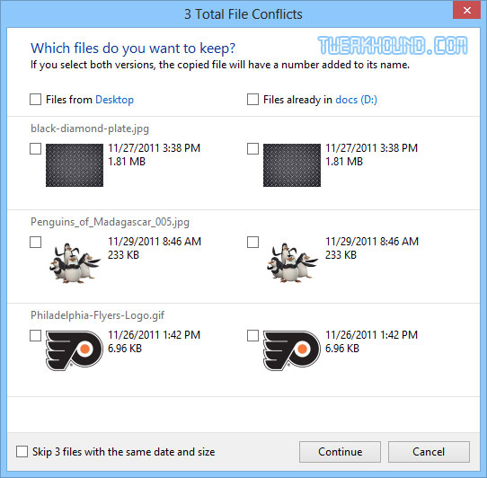
Choosing Let me decide for each file brings up the following window. You can see a thumbnail and description of each and choose.
Back to that Hide folder merge conflicts box. Default is checked. Unchecking it brings up the Windows below. If you click Yes you get the two previous Windows. I don’t even understand why this option even exists.
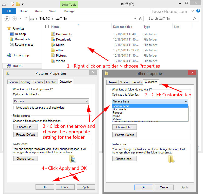
Optimize Folders
Windows 8 has various viewing and indexing options for specific folders. Default viewing options are changed based on the content of the folder. For instance, the Pictures folder will display thumbnails while the Documents folder will display details. If you’re like me you create a lot of new folders for various items. They are often not optimized for the right file types in the folder, especially if the folder has various file types. This can slow the viewing of folder contents. To optimize your folders: Right-click on the folder > click the Customize tab > in the Optimize this folder for: box, choose the appropriate setting (when in doubt I recommend General items) > Click Apply and OK.
